The MTA’s Website: A Gateway to Confusion
Clear and concise communication is essential to getting a message to six million people quickly. Sadly, the MTA’s website is anything but clear and concise. Yesterday, MTA Chairman, Joseph Lhota explained the need to overhaul the MTA’s communication assets, and the website would be a great place to start.
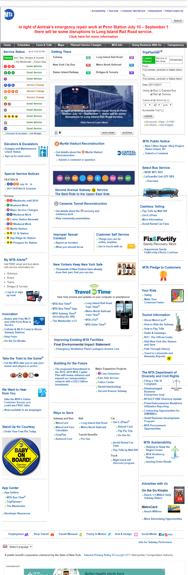
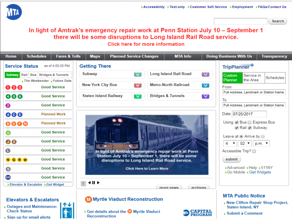
As it should, the homepage of the MTA website contains important information that riders need to access, such as service status, schedules, maps and the TripPlanner app. However, the homepage also contains a wealth of other information that adheres to no logical or structured order, which makes finding this helpful information nearly impossible.
It appears that this secondary information is just tacked on wherever it will fit, as if the webmaster knows that the remainder of the site is so impenetrable that information not on the homepage will never be found.
The MTA’s website is often a person’s first impression of the agency. It is the place to retrieve important information and learn how to navigate the system. This website instead makes this information difficult to find and does little to instill a feeling of confidence in the MTA. The website is not a map it’s more a hall of mirrors.
A minimalistic, clean design
The current website was designed with good intentions six years ago, when the website was upgraded to improve the customer experience under MTA Chairman Jay Walder. At the time the MTA introduced the website saying:
“The website’s new minimalistic design is cleaner, better organized and geared toward enabling customers to quickly identify the information they need.”
Since that 2011 launch the MTA has strayed from these principles and added so much to the homepage that the result is anything but minimal or well-organized. This jumble of information desperately needs an overhaul.
MTA – Take advantage of low hanging fruit!
In a time when so many elements can be out of one’s control, a website is one place where organizations can shape and influence the customer experience. A good website says that an organization is ordered, aware, and current. It can demonstrate a willingness to engage with easy-to-find contact information. It can show that the organization understands the value of the client’s time with a site that is intuitive and user-friendly. The MTA’s website demonstrates the opposite of these qualities, and the lack of a major redesign in over six years is evident. It can make a rider wonder: if the MTA doesn’t have it together to maintain their website, why should I trust them to maintain their transit network?
Other governmental organizations have developed websites that put the user first by simplifying their sites.
There are many government and transit sites that function well. Here are a few good examples:
Utah State Government
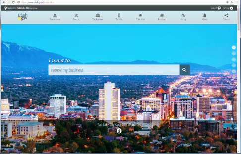
The Utah State Government homepage has a simple, user-friendly interface. The page opens with a single prompt asking what you want to do. Users type in what they are there for, and the website directs them to the appropriate page.
LA Metro
The Los Angeles Metro homepage is designed knowing what its customers need most. The front page is an 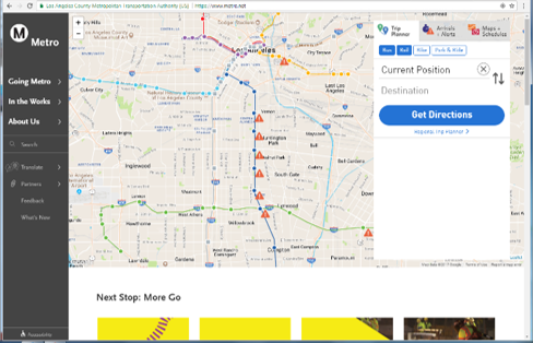 interactive system map that shows current service status updates. There is a prominent Get Directions box. To the left, a narrow sidebar contains links for Going Metro, In the Works, and About Us where users can learn second tier information like facts about fares and active and planned construction projects. Content is categorized in an information hierarchy and prioritized for easy identification and retrieval.
Chicago Transit Authority
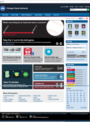
The Chicago Transit Authority’s homepage has more information than the two earlier examples, yet is well-organized with clearly delineated segments. Quick links to resources like schedules, maps, alerts, a Trip Planner, and current service status updates are prominent on the homepage. They and other homepage features are laid out in a well-organized and logical manner.
First impressions are the ones that last.
In our ever-changing and fast-paced technological world, communicators only have a few seconds to capture the attention of their audience. A website’s homepage must be concise and direct. Too much information upfront could be the difference between success and failure.
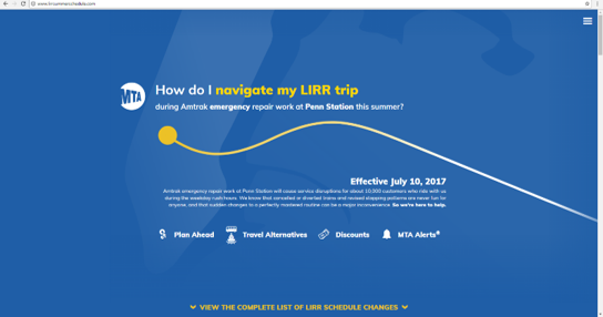
Recently, the MTA launched an independent website to explain summer LIRR service details in light of the crucial Penn Station repairs. Here, riders can easily access the information they need, which is well-organized and easy to retrieve. This model could be used in redesigning the MTA’s main website. This temporary website is aesthetically pleasing and is not front-loaded with too much information.
It is time to drastically improve the virtual gateway to the MTA. Let’s hope that the MTA redesigns its website using skills it obviously has and with a much better awareness of its users.